
Project Killdance
A downloadable PC game
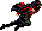

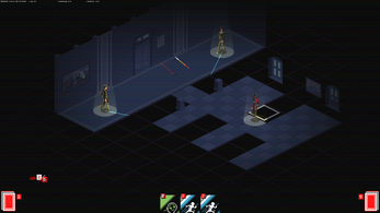
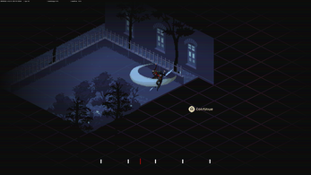
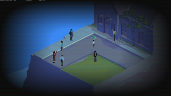
Project KillDance is a Noir tactical action featuring a one-man army strategy and instant-death combat. Slowly observe surroundings, choreograph each killing move, leave no survivor, and become the spectral death.

Controls
Mouse (left click and right click) to play cards
Keyboard (left and right) for replay mode

Features
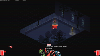
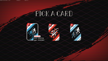
Time is frozen, make your best decision using the action cards in your hand.
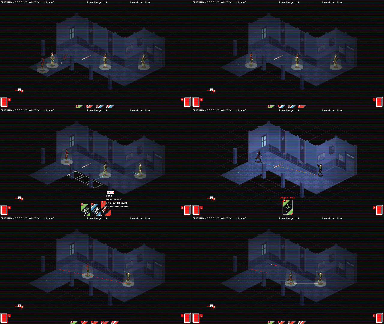
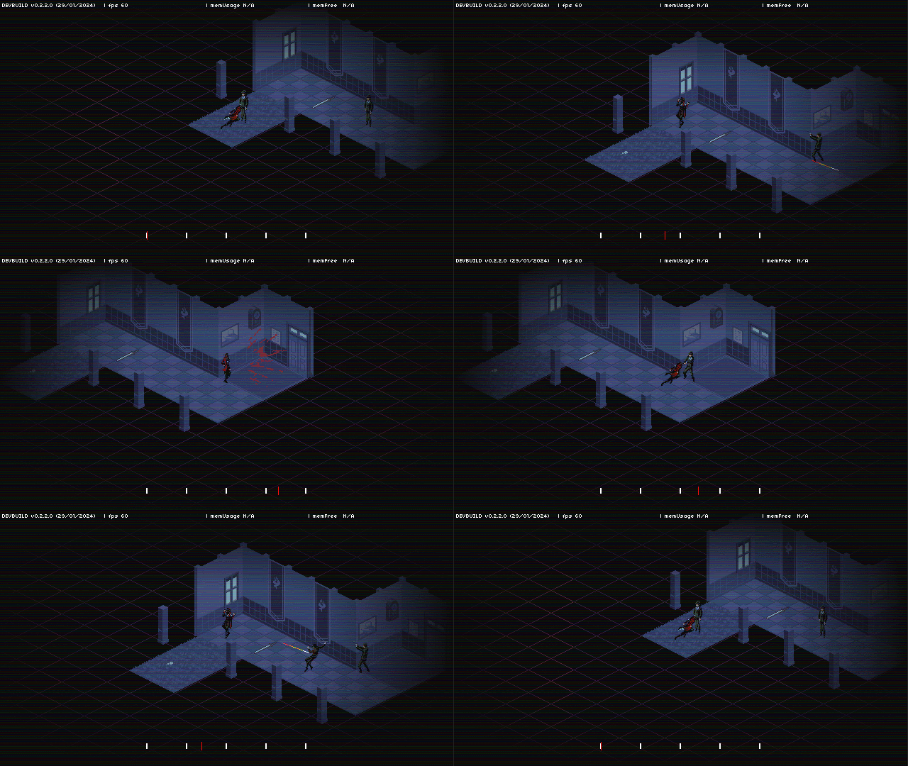
Watch your action in real-time replay.

Credits
PROJECT KILLDANCE
by Toge Productions
Wildan Rahmat R - game designer, programmer, artist, technical director
Dimas Novan D - narrative designer, artist, creative director
Yohannes Yokomichi Tios - game designer
junkipatchi - narrative designer, storyboard, artist
Robertus Rahardian Haris - programmer, cinematic editor
Kriswin Yuniar - artist
Roland Melvin Zabarjad (Pixel Priest) - artist
Masdito Bachtiar - SFX, BGM
Budhi Luhur - SFX
| Status | Prototype |
| Rating | Rated 4.7 out of 5 stars (45 total ratings) |
| Author | Toge Productions |
| Genre | Strategy, Action, Card Game |
| Made with | GameMaker, Aseprite, FL Studio |
| Tags | 2D, Noir, Pixel Art, Singleplayer, Turn-based, Turn-Based Combat |
| Average session | A few minutes |
| Languages | English |
| Inputs | Keyboard, Mouse |
Comments
Log in with itch.io to leave a comment.
Would really like to see this as a full game ! Def need a release of the songs too, loved the last one !!!
A weird bug that I found regarding the final room background music. When I hit back to reset the run, the song still plays, and it layered with the regular music (doesn't apply on the final room when I came back, it just continued on). And it still persist after the end scene and when returning to the main screen/menu.
Other than that I found the game to be really good, especially satisfying when you can pull those smooth quick kills!
Cool game. Would like to see it expanded on
Though it would be nice if movement cards were a tad more clear. "Quickstep" seemed useless initially til I found out it meant you move instantly unlike the normal movement cards which werent fast enough to get away from bullets sometimes. FTL is also a bit weird cause It said "Warp" which made me think I could go through walls when it cant
Other than that, no major gripes that I assume wouldnt get fixed if this idea moved forward (more animation, ways to remove cards, etc.). Keep up the good work!
this is a good frickin game i hope you make it full game on steam or something. Just from this trial alone im sure its worth to spend my money on this
schizophrenic woman
Love the game-play and the visual style. Looking forward to seeing what comes from the game in the future. Movement was really fun to play around with and the cut-scenes were really entertaining to watch.
I will say, I am kind of confused about whether or not I killed my family or avenged my son in the end.
THIS GAME SHOULD BE A FULL GAME.
from just this prototype, i really like it, deck building and action game !?.... awesome
for the story, i really have a big expectations on the story since mas dimas and junkipatchi in the credit.. graphic is awesome, gameplay super fun..
this is my playthrough on this game.
Will you make a full game on steam someday? You def should.
A better UX would be nice: AP is too small, card icons are too messy and sometimes too similar (f.e. sidestep and warp), needs to be more readable imo.
But just a suggestion, to name the game just "KillDance" to be more memorable and be less generic with that Project word 🤔
Suggestion: two seperate hands, one for attack and one for movement, would benefit this system greatly.
I would also suggest adding "ghost motions" to bullet paths when planning your routing, as bullet paths are currently somewhat hard to understand right now.
To elaborate on that, I mean have a ghost of the action you're about to take loop in front of you, and if it intersects a bullet that will hit on that path, it plays an animation of your ghost dying.
This wouldn't reduce the difficulty much besides providing more feedback on planning, since the core difficulty here is more based around foresight and not getting yourself trapped in corners. Fights like the final boss are a fantastic showcase of this, since that fight is both chaotic enough to need such a feature and one of the better designed dodge-loops in the game.
Designing around pathing puzzles like that will be an excellent way to flesh this game out.
If you need design help or pixel art consider me enthused with the project, I'm more than willing to contribute.
i agree but it might be enough to just draw a red line when your path is intersect with bullet path.
also its better to red-outline the enemy that will die instead of a circle under him that is hard to see cuz its always lost in other lines
good points all around. I found the circle to be plenty, but the red outline WOULD be more visually pleasant and readable so long as it doesn't obscure other red elements.
a really nice game
I will wait for the final version
I enjoyed the game, the game feels really polished, the art and the music is good. At first, it feels frustating to do multiple attempts on clearing the level only to get shot again because I don't have AP to move lmao.
I thought the card that let you teleport can help me dodge the incoming red bullet, but it seems not, it just let me travel bit longer than the basic move card I guess?
Overall, it's an interesting and good game.
I love the game, my main concern is it being too short, I hope to play a longer story some day.
It feels somelike superhot, but in 2d and with a core deckbuilding component.
Other thing I might change is having an option of getting a movement card at any point somehow. As other user mentioned, almost always you need some mean of quick movement, and it's no fun when the rng does't give any movement card to evade an incoming bullet. Perhaps, adding the option of trading any card for a movement once every turn would solve it.
one thing - I can not understand the system behind bullet travel. I tried to understand it, and when I thought I have, I died when I took a deep breath on orange. I have no fucking idea what the color of the line means. I have no idea what it does and how it changes. Please, make it more obvious. A fucking pop-up text would already be great
and i think this game has a lot of potential in terms of both story and gameplay
its very cool and funny game. i love this gameplay where you can think and do something in fast pace
This is really polished and has some super cool moments, but I'm kind of hung up on... the core mechanic of it being at odds with the rest of the design. The tense action where you have to decide moment-by-moment how to not die that turn is great, and the action economy is a good abstraction for it... but ultimately, success or failure hinges almost entirely on Did You Have Enough Basic Moves In Hand. The overriding concern is always "is a bullet about to hit me?", and the answer is almost always "yes", and the solution is always "play a move"- which means, if you don't have one, all the rest of your planning doesn't matter, and you're dead.
Other deckbuilders have this core problem, of course, but they usually smooth over it with a health system that gives you a certain tolerance for failure. When it's an iterative system, building your deck properly you can lower the chance of being forced to take hits on your turn, and the outer game loop is about managing that risk. But... in a game like this, where a single failure means death, any significant random failure rate is a feel-bad. And the failure rate varies with the level design: the less cover, the more movement you need to be doing, but the incremental deckbuilder thing locks you into a certain proportion of offense to defense, forcing you to mulligan over and over to find viable hands.
I do like the action economy aspect- keeping an eye on your AP and moves-in-hand to ensure you don't get stuck taking a breath at the wrong time is a good tactical challenge. The question is how to preserve that core challenge- making the most of limited and unpredictable options- without creating as many situations where all roads lead to dead. Maybe... separate decks for moves and attacks? Or the ability to slash enemy projectiles out of the air? More cover options in the level design? I'm not sure exactly what the right solution is, but I think you want something to cut down on "a big guy with a machine gun is immediately firing at you turn one and your opening hand doesn't let you move, RIP" moments.
(Also- is there any significance to those Corrupted cards that sometimes show up in longer levels? I thought maybe relying on them gave you a bad ending, but I played through twice without using Corrupted cards the second time, and got the same outcome. Just a catchup mechanic for if you find yourself in a stalemate, or is there something else going on there?)
great game!
I was blown away by the quality of the game, I love the artstyle and the game seems really interesting, I really hope to see this game have a full release one day, it's very promising !
Damn really good XD... I dig this lololol XD... the reply at the end really satisfying lololol...
The thing that could be improved maybe the visual feedback... it's pretty hard to know whether the bullet will hit us or not, one of the cause maybe the nature of isometric, it's pretty hard to see the trajectory of the bullet... maybe if there's a top down map, it could be useful to see the trajectory...
And it seems each card has some speed and max distance, I feel if you could show it on the map it could be really useful... like some ring to indicate the radius... for the speed... I'm not sure, maybe the indicator where the bullet will be when we execute the action?
At a glance, the difference between the Sidestep and Reposition is the distance and the speed, where Reposition has higher distance, but Sidestep has higher speed. The FTL is kinda instantaneous... But it's a bummer that FTL only works in straight line, it can't bypass the wall...
and yeah, kinda need a visual indicator if I take a breath will the bullet hit me or not XD hahahaha
damn, I cannot play the game, my screen size is too small and the card is outside of the screen :'), I can't click it
Hi, we uploaded a new version of the game, please kindly check it, thank you!
played today, game window is too low so bottom of the cards are covered by bottom windows pannel. no music-sfx and resizable window options would be nice
Cool mechanics! I feel like Sherlock Holmes when he's planning to attack his enemies. I hope to see some more variations of the enemies, maybe like melee enemies.